
Design Resource Kit - Naka Media LLP
One of the most common questions we get asked is ‘who did your design work?’; and, of course, we did it in-house. We wanted to put together this blog post to share a ‘behind-the-scenes’ look at our design process. Since this is our own project, we can share some early concept logos, and a clearer look at what the final product would traditionally look like; a design resource kit.
Logo - Color, Type & Design
Our goal with the Naka Media LLP logo was to create a modern logo with a sense of personality. We wanted a logo that would be minimalistic in nature, without feeling clinical. When designing the logo, we were conscious of the fact within our industry, there was a tendency for companies to be overly pretentious, resulting in a somewhat dark and moody look. For Naka Media LLP, we wanted our brand to be friendly and inviting, as to not alienate small local businesses and clients in the charity sector.

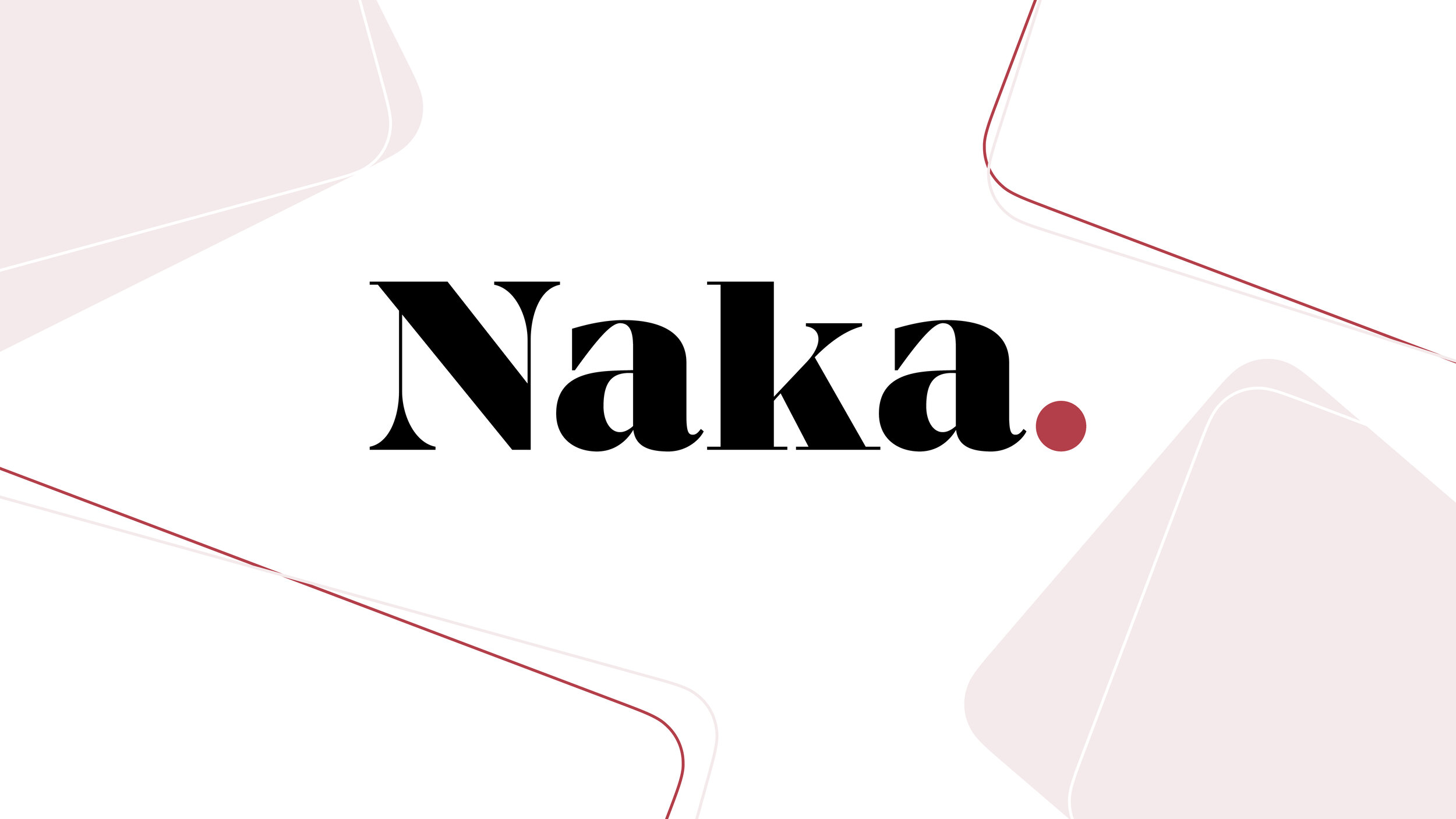

The process of creating our logo and design language was experimental, as we searched for the perfect logo. We went through hundreds of logos, slowly iterating as we formed the final logo we have today. Following the Japanese origin for the company name ‘Naka’, we played with many different ideas, such as more Japanese inspired typefaces, and the incorporation of the Japanese symbol for Naka (中). This saw us incorporate a large dot in some of our concepts as a representation of the rising sun. As time went on, we wanted the word ‘Naka’ to be a key memorable detail, so we condensed the rising sun idea into a larger than average full stop, and shrunk the ‘Media LLP’ text. We did this as we wanted to still include this information, but not to divert attention away from the key word ‘Naka’.

As part of Naka Media LLP’s ‘Design Language’, we decided on two different typefaces with the latter being formatted in several in different styles, depending on the context. The title style, the key one used in our logo, is incredibly important to the design language; from default, we selectively increased the weight of the typeface, giving the typeface narrower hardline serif’s and thickened the vertical axes. The contrast of the two helped give the logo a nineteenth century french didone look; this is popular in contemporary fashion, thus has contemporary connotations counteracting the classic nature of san serif typefaces. We tightened the kerning of title style, to help structure and shape our logo. Our heading, text and subtitle styles deploy a more modern and reliable typeface; it is deployed in areas where space and legibility is of concern, and helps demonstrate a modern identity throughout our digital presence.

Our brand was built to be versatile so the main logo comes in three different scales; full, half and monogram. The full logo is our primary logo and is most commonly used. The half logo is designed for space where glanceable clarity is needed, such as being composited on videography. Finally, our monogram is intended for extremely small sizes such as our website favicon. Each of these three logo scales come in up to four colour variations, such as ‘Venetian red & black’, ‘Venetian red & white’, ‘full black’ and finally, ‘full white’.


For the colour science of Naka Media LLP, we wanted to be flexible in defining our accent colour. We determined a few other colours which could work, to enable versatility within the design language. We originally started with Vibrant Red #FF0000 to match with the idea of the rising sun, but this was muted to give balance to both white and black text, resulting in our main house colour. Following this, near white and near black accent colours were determined. Following this, the complementary colour palette was made to give our overall design language some growing room; this means we would have two design languages that are distinct while simultaneously working harmoniously in tandem.


These 6 colours, included in these 2 colour palettes, were balanced with each colour, and in their relationship to the other colours. Although the two colour palettes are intended to be used entirely separately, there are a few select and rare opportunities that the core and complementary colours can work together across the same colour class.

Creating a strong design motif
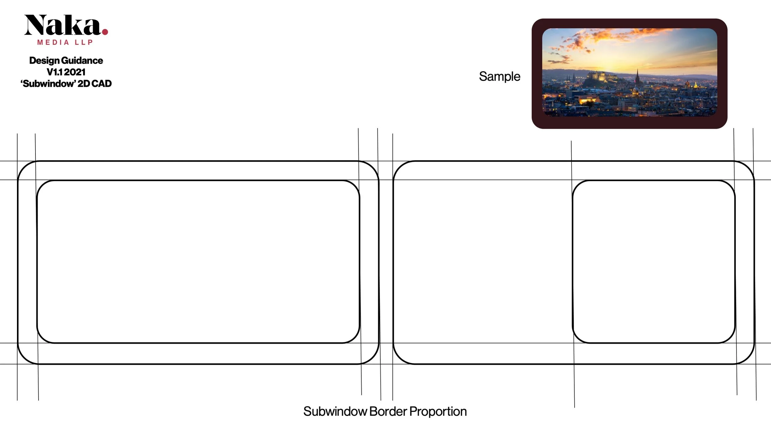
When we started this project, we had two key aims; we wanted people to remember our name, and that we create videography. We experimented with the idea of having a video as our logo. We knew we could not just composite our logo on a video and have it feel like a logo, and that is why we deployed a frame to make it feel far more cohesive. We call this the ‘window’; throughout Naka’s design language, it is our strongest and most important motif.
The window is a rounded rectangle, and has been standardised throughout the design language to enforce our strong brand image. The standardised window was formed at the ratio of 16:9 to match portions of a typical piece of video content. Secondly, since Naka Media LLP is targeted and focused on the development of content for social media platform, the window features rounded edges to mimic the shape of traditional mobile phones. When creating our Naka Media LLP Design Resource Kit, we developed design guidance documentation to support recommended usage of the window, outlining the information safe areas, and highlighting the best usage for visual clarity and balance.

Many media production companies conform to only focus on the traditional orientation of landscape video, but we are unique in our expertise in the creation of high-quality videography in both portrait and landscape orientation. Consequentially, we do not have a single defined orientation for our window, and we actively play around with the window rotation. We also feature a square and rectangle of 4:3 within our marketing material where applicable. As you will see through the gallery of the Instagram photo below, the creation of the window has been incredibly important in allowing us to develop a strong brand identity, with a style that places our work at the forefront.


We use the window in different ways through our design.; whether it is a solid shape or line form such as the logo previews at the top of this blog, it can be used as part of compositing videography and photography. For the times in which we want to convey text, we have developed what we call a ‘sub-window’. These can be used for any purpose, such as being a name card in a video.

As you can see, the development and usage of the window and sub-window has had an impact in creating a strong design language, that stretches far beyond our logo. Once we combine these elements with our core palette and defined typefaces, it can create incredibly powerful results. As such can be seen in our Naka Media LLP Showcase 2021.

Dress for the occasion
A good logo and design language is only as good as the usage of the assets throughout the rest of the organisation; that is why at Naka Media LLP, we have worked tirelessly on infusing as many parts of the business as possible with high-quality design, to help strengthen our brand image and inspire trust and professionalism with our clients. This can be seen within our invoice / quote documents; it is tailored towards our industry, blends our core colour palette, typefaces and windows, in a way that makes it uniquely Naka.

On top of our aforementioned logo, with the social media nature of Naka Media LLP, our design resource kit features 6 perfect portioned icon logos, designed for social media and made in coordination with the research of the iOS icon standard.

Like our invoice / quote template, we have made sure no detail goes untouched, so we have also designed a bespoke email signature. Designed to be simple, whilst also sharing the most important information quickly. It is a great way to make a good first impression.

In the spirit of versatility, our Design Resource Kit is applicable for special edition branding assets; as a queer lead company, our first special edition collection was designed in support of pride month. The collection includes logos, profile pictures and banners for social media purposes, allowing us to show our pride while promoting our brand.


Along with this, we have several collections of logos; though our main logo is the most commonly used, these collections include a few others, created primarily for SEO webpages and targeted marketing purposes. The first of these extra collections is the location type.; these logos feature key demographic areas we offer our services to, taking the place of the ‘Media LLP’ in our main logo. Like the main logo, these location logos also come in four colour variations.

The other two collections of logos are the client type, and genre type. These both see the additional type, added alongside the main ‘Naka’ type. We have three client type logos, for each of the industry sectors we create content for. The genre type features logos for ten different types of content we produce.

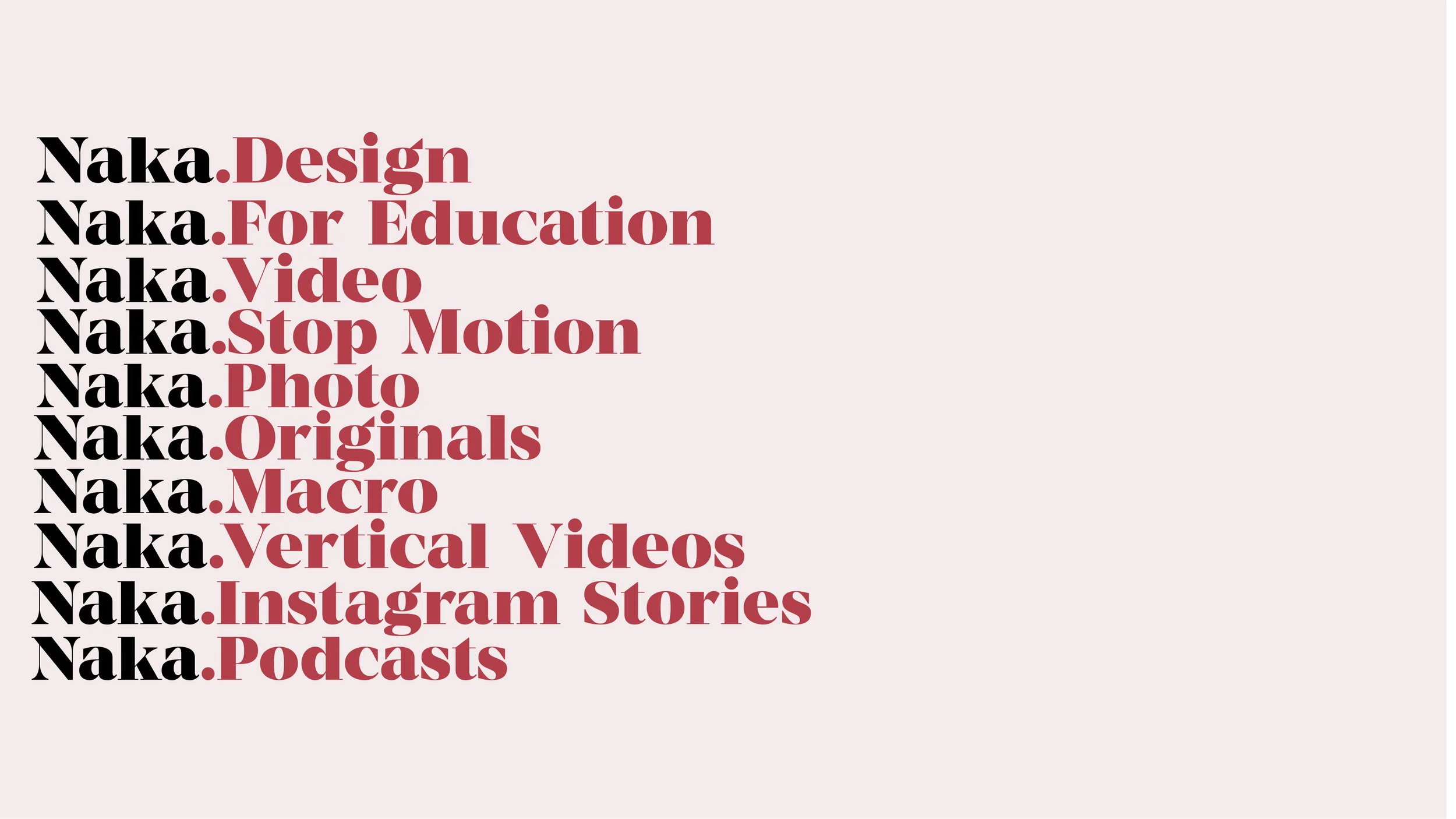
The client type and genre type also include versions that feature a location subtext, meaning each client type and genre type could have 55 possible options. With this many options, there is definitely a perfect sub-logo for any occasion.


Creating a design resource kit.
One of the things that surprises our first-time clients is our extensive ‘Design Resource Kit’; we are aware that even one logo may include colour variants, social media centric icons, and other small assets. That is why we put together a design resource kit to help our clients unpack all the information provided, and be able to use all the available resources as effectively as possible.

The folders are optimised based on how our clients have best used our graphic design in the past; it is curated to be a one-stop shop for all our client’s graphic design needs. This is especially important, as large operations require sub brand logos, product branding and documented guidance for how the graphic design can be best used throughout the organisation.

At Naka Media LLP, we treat the ‘Design Resource Kit’ similarly to a software release; we each include version numbers, so you can make sure the team is on the same page. This leaves the door open for updates, such as the addition of new assets, invoice templates, or the addition of branding materials for a new product. Although not present in this ‘Naka Media LLP Design Resource Kit’, we do sometimes incorporate asset codes, so you can more easily share assets with a colleague.

The kit is complete with everything you will need to get up and running with the design language. This includes resources such as typefaces, colour samples, and templates where applicable.
Conclusion
As of March 2021 and version 1.4 of our ‘Design Resource Kit’, we have 1,277 assets on hand, growing from just 185 assets in version 1.0! The Naka Media LLP graphic design process has been exceptionally ambitious and expansive; the result of all this dedication, is a strong brand identity, has had a lasting impact with our clients.
As we hope you’ve seen throughout this document, with the goal being maximum future-proofing, even small projects can be built up of many separate assets. That is why the final package / ‘Design Resource Kit’ is as important as the graphic design itself! Design becomes iconic due to the associations it acquires through usage, thus by making it easier to maximise the use of graphic design throughout the business it has contributed to one of our key missions of delivering exceptional graphic design.