
Creating a Brand Identity From Scratch-The Unbound Screen
We were tasked with the objective to create a new logo for a cinema consultation company The Unbound Screen. The goal was to create something simplistic in nature that could comfortably stand on its own, especially if surrounded by other graphics and logos.

The logo has been designed to be quite versatile. The main monogram symbolises the 'U', as in 'Unbound', and features some RGB flourish to represent unbinding (unbound). The RGB colours being used to parallel the video / cinematic nature of the work. The simplistic typeface used has been chosen with the goal of making the logo professional and timeless.

The ‘The Unbound Screen’ logo was built with versatility in mind - that’s why we created vertical, horizontal and micro versions of the logo. This means that the brand can perform well in different contexts, scales and colour palettes.

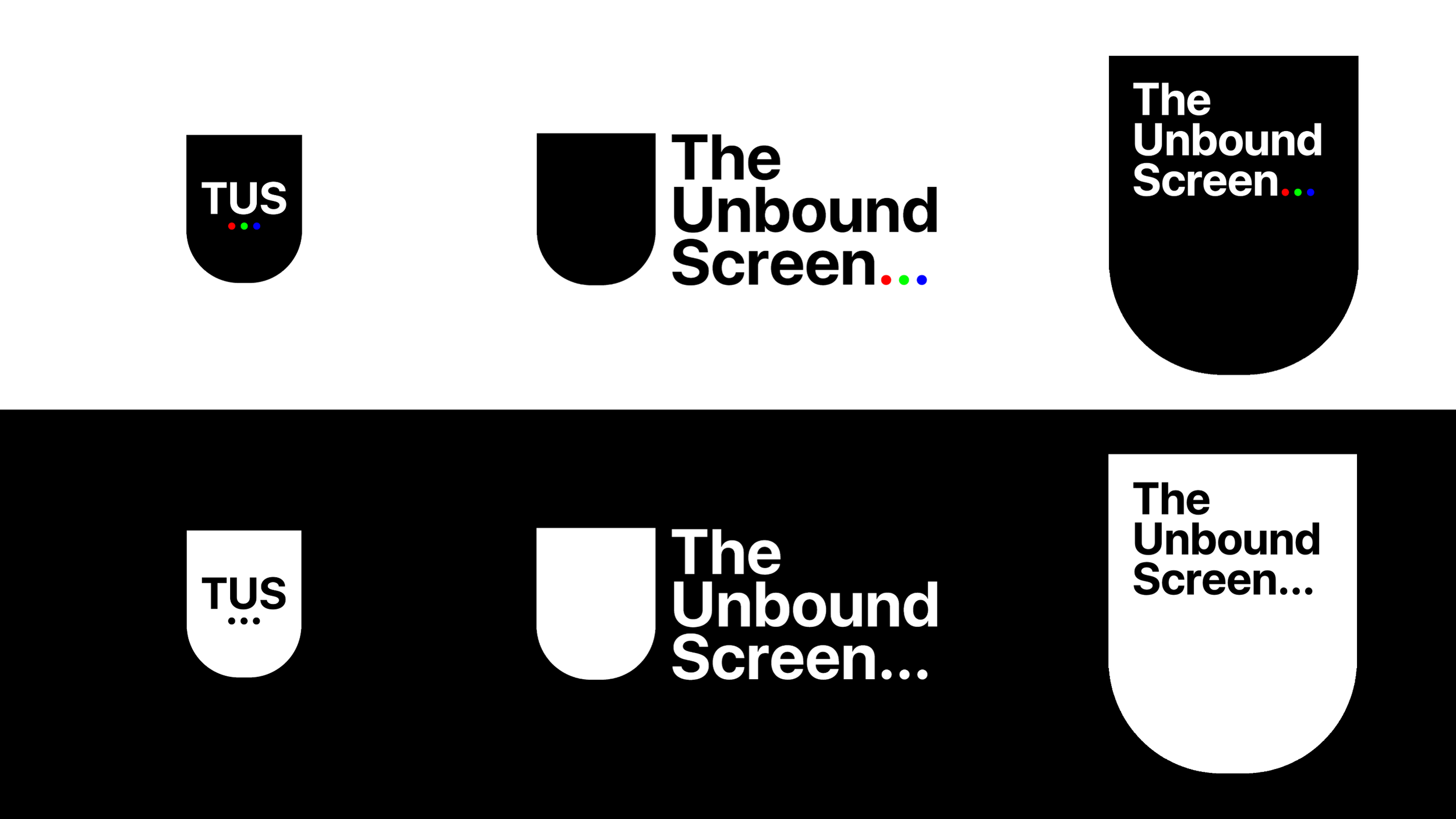

In line with our objective to create a versatile logo, the main vertical logo was proportioned to look complete from default and natural when addtional is text added for special occasions.

2021 Update
After being set up and networking for a while, Scott Blair of The Unbound Screen asked if it were possible for us to create business cards. It was a joy to be working with our design again and continuing to support local businesses. We took pride in creating something simple, legible and engaging- with all the information you need.
this has prompted us to make our own cards, and as always, if you are looking for something like this for yourself- contact us. For now, enjoy the design.


