
Motion Graphics showcase and collection - 2019-2021
Motion graphics are something we hold dear as they can bring so much life to a logo or design. We have worked on our design skills for the last three years to hone in and create beautifully alive pieces of work. We wanted to share this collection with you as it showcases some of our best work from 2019 up until 2021. We felt that more space is needed for purely our motion graphics as it’s often something we simply add on into a job and are not sought out by themselves. We have a real passion and joy for motion graphics, take a look at this collection of work and see for yourself.
Scotlands Food & Drink County East Lothian
Our collaboration with Scotlands Food & Drink County East Lothian saw us take a logo which was complex, and made up of many parts - and make it feel alive. Designed for use across a wide selection of videography work, the goal for this logo motion graphic was to be intricate but versatile. This required deconstruction of the many aspects of the original graphic design, so we could rebuild an unlaminated replica of the original, to which we could then apply motion. The key challenge we overcame with this motion graphic was giving each section of the logo agency, requiring multiple distinct techniques, and syncing their actions so that they would pull together for one final moment.

Rock & Bird
This project was one of our first attempts to integrate motion graphics into a finished and completed design. As you can see, we have come a long way but even something as simple as this for the oystercatchers adds so much. This little bit of motion graphics adds a lot of charm to what was a simple but thematically important logo. This charming element is reflected in the shop itself, the area the shop resides in and so fits its purpose excellently here- the end of a cute stop-motion short film.
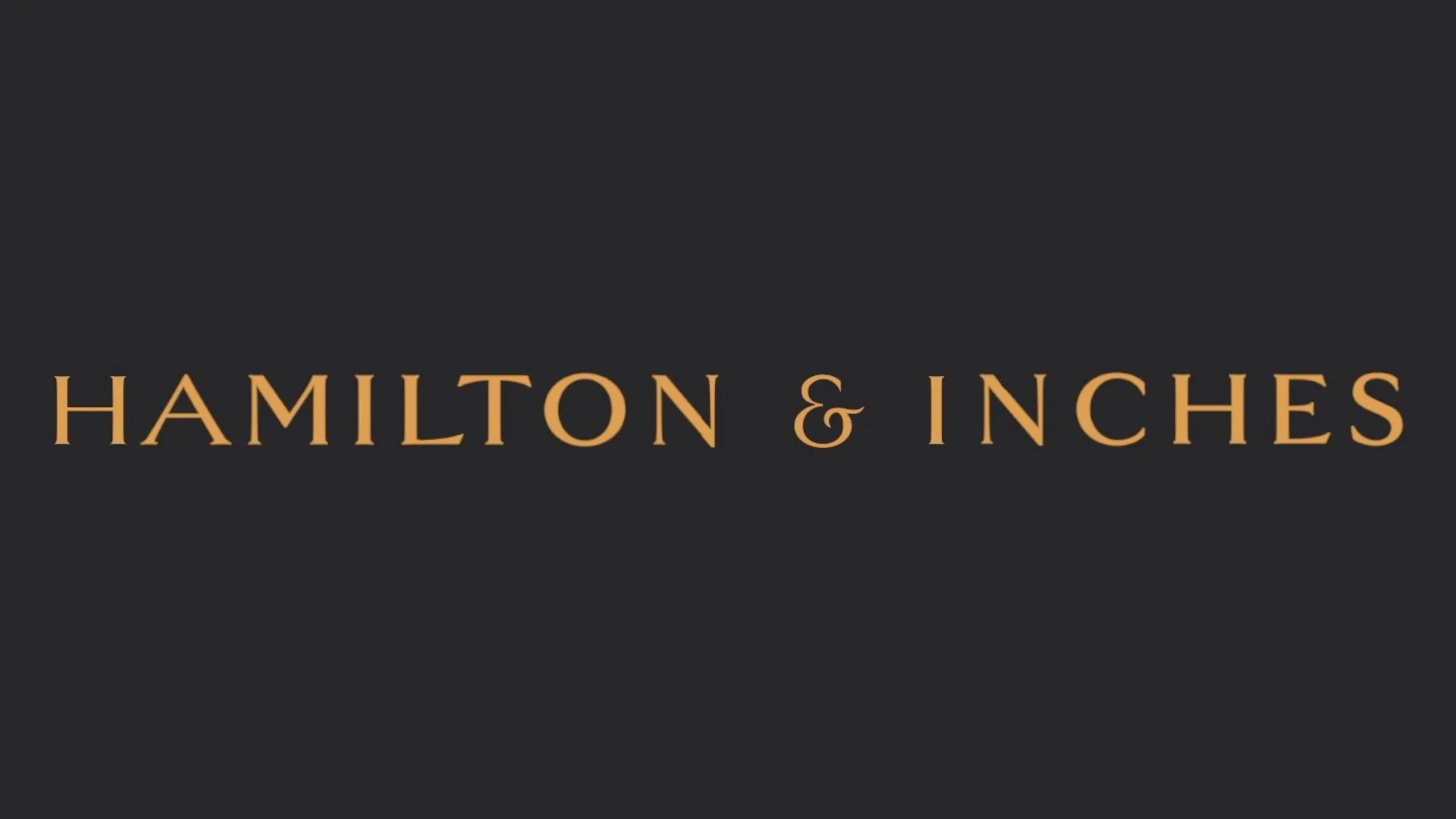
Hamilton & Inches
Created during Anton’s time with Hamilton & Inches, a bespoke selection of motion graphics assets were created for use on a wide section of videography content. The two key motion graphics were for the main Hamilton & Inches brand and the line of Scottish Gold jewellery. The motion graphic for ‘The essence of Scottish gold’, sees the graphic design given life through a hand animating the drawn effect; fully realising the original intent of the script typeface featured in the static logo - now embellished by the addition of motion.
The Hamilton & Inches design sees the full-sized Hamilton & Inches logotype metamorphose into the H&I monographic. Despite its elegance, this was an incredibly complex motion graphic due to a couple of complex challenges, such as discarding redundant characters graceful, tweaking the form of each of the key characters (H, &, and I) to fit those of the monogram, and relocating the key letters. Due to the key characters having to travel different distances to the centre of the canvas, meant each had separate timing, and just the relocation of characters required 6 perfectly orchestrated animations. However, the moment in which the key characters intersect was the ultimate puzzle, as required working at a pixel level to ensure a perfect blending of characters, not only to create a monogram but create a mirror image of an original which was not created with such constrains. All this happens in under a second and the results speak for themselves.

There were also a couple of adjacent motion graphics which were created, that saw recontextualization of these assets and expansion of similar techniques, to expand on established work in a cohesive and meaningful way.


Naka Media LLP
For our own motion graphics, we were able to work in parallel with the creation of our Design Resource Kit and as a visually-driven company, the two have a symbiotic relationship. Nowhere is that more evident than with the creation of our iconic ‘window’ motif. From the conception of our design language, we experimented with the idea of having a video as our logo. We knew we could not just composite our logo on a video and have it feel like a logo, and that is why we deployed a frame to make it feel far more cohesive. It is our strongest and most important motif. Due to this the ‘window’ and the ‘sub-window’ were built with the intention to be one with movement. Beyond just featuring motion within them, our extended marketing materials, slide and shuffle throughout marketing materials, we stretch, distort and rotate as a literal metaphor for our willingness to think outside the box and our ability to work in different videography aspect ratios. This can be our ‘2021 Showcase 2’ or the ‘Rotation motion graphic’ on our homepage.


Like many of our clients, we have applied motion graphics to our ‘full logo’. This motion graphic was orchestrated to be cinematic, to invoke a sense of filmic creditability. Combined with a specific piece of music, the motion graphic is inspired by liquid moving and being poured. This motion then forms the final logo.

Royal Bank of Scotland
Motion graphics don’t need to just be a flourish on a video, it can be the video itself. In a collaboration with Stripe Communications and Double Take Projections, Anton created distinct motion graphics for a unique use case. The brief was convoy feeling through text alone and pursued through words alone in a striking manner. This was then to be projected onto the side of Dundas House in Edinburgh.

The whole spectacle was incredible and one of the ‘largest’ projects we have been involved with to date, being the size of a very tall 3 story building. As you can see, any issues with the video would be scaled up when projected that big, so all errors had to be removed. Here is the video, not on a building.

Motion Graphics infused projects
Some of our best work has been when we have incorporated all these graphic design lessons and motion graphics into larger projects. As you can see, these animations help tell the story and improve viewing and engagement. This video is around 50% motion graphics but it doesn’t necessarily feel that way, and it’s maybe not something you would notice.
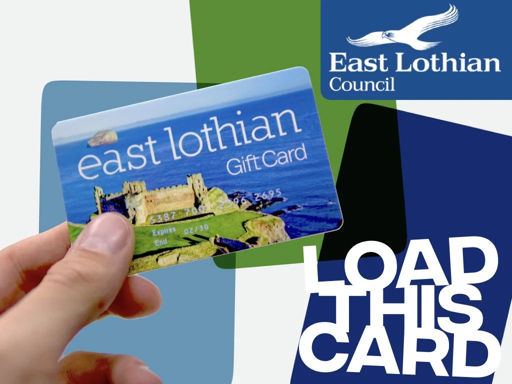
As in our Load This Card video, you can comprise fo a motion graphics ‘world’ that then the filmed video can sit within. This ‘world’ comprises of smooth transitions, text and other little details to make the piece feel cohesive and flow smoothly.

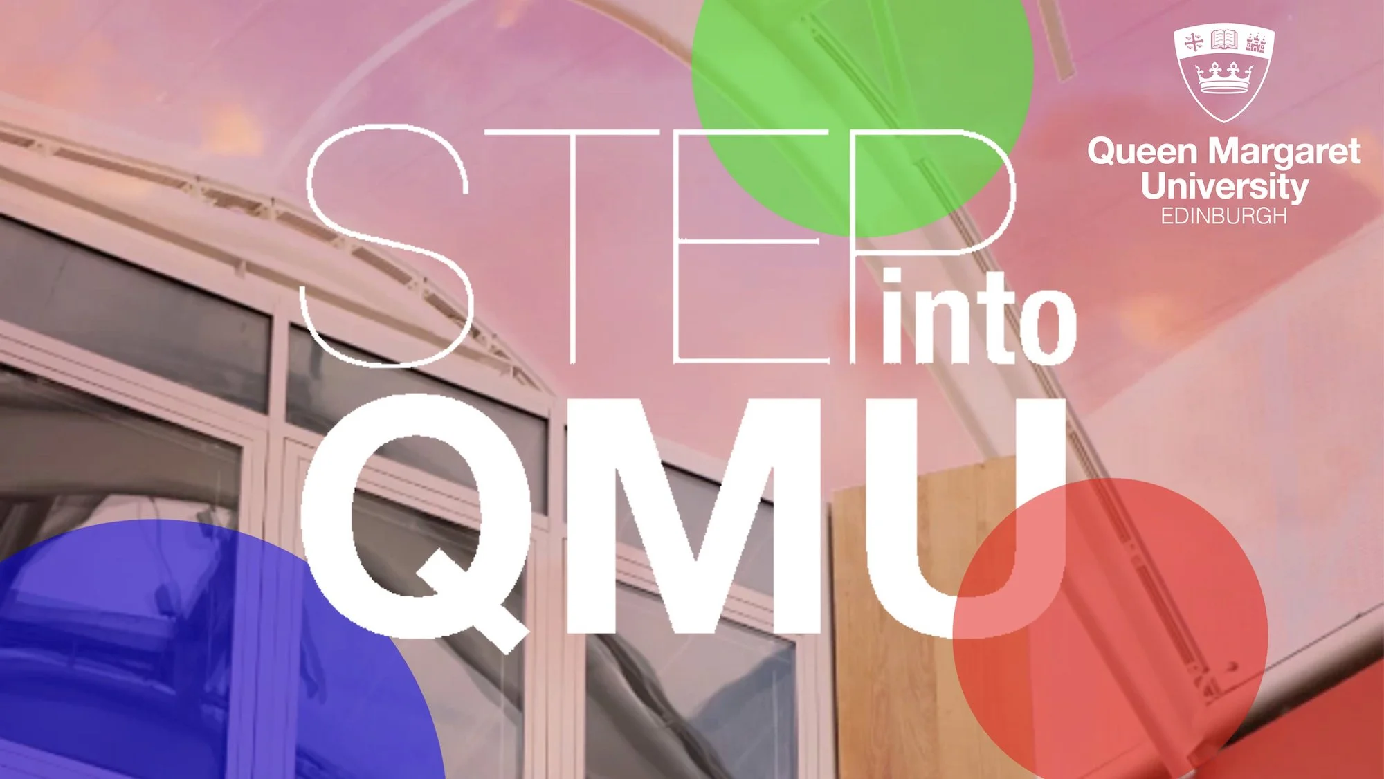
As with our QMU work, we are constantly implementing motion graphics to make a cohesive feel.

Conclusion
It is highly worth noting that motion graphic is made up of so much but can also be a standalone product and craft. The ability to implement all of these techniques is also a skill we have worked hard to hone, at Naka Media. Motion Graphics is an important flourish that is often overlooked or undervalued; hence why we have created this page to showcase and also discuss our use of them. Thank you for reading about our work and various projects here. If you would like to find out more about our individual work please have a look at the portfolio section of our website. You can always contact us if you would like to learn more.