
Clock House Furniture - Brand Revitalisation
During the summer of 2018, Anton teamed up with the established luxury furniture manufacturer and store Clock House Furniture to update their digital and social media presence, and brand identity. One of the first and critical steps in this project was the revitalisation of the graphic design assets being used through the organisation; the brand revitalisation project also included creating templates, sub-brand logos and packaging design.


The goal was to take the iconic imagery of Clock House Furniture, and streamline it to work better on digital platforms. Key work was done on the monogram, to simplify the key shapes and lines to create a modern and memorable icon. The monogram was horizontally compressed to allow the logo to function far more effectively in more occasions; for example, to fill a square profile more effectively. The overall goal of this process was to create an image that would work better when formatted small and moving, such as scrolling through social media.
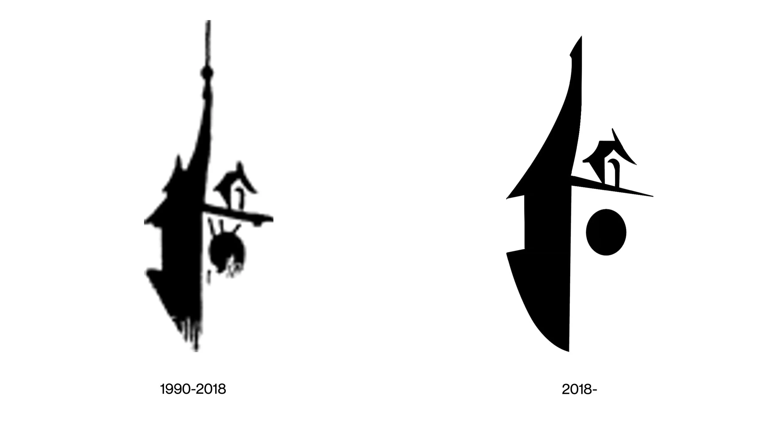


The new logo, like its predecessor, was built with many different scales in mind; therefore, when it came to revising the typography, various logo scales were given a single unified typeface. The new typeface deployed was chosen for its improved legibility, and for availability in a wider variety of typeface weights, thus enabling more adaptability in future. The typeface was then treated to some expanded kerning and tightened leading, to help the logotype feel luxurious yet compact. The result of this work was three new logo’s which demonstrate a more consistent blend of monogram and logotype which help create a more unified brand throughout several logo representations.


Another facet of this project was an effort to fine-tune the usage of the logo in terms of colour. By the adoption of softer and more friendly colours in marketing materials, and colour matching the logo by 30%, it aids the logo in having a smoother look and feel. This was done by using colour in ways which compliment the logo, and presents a level of brand polish and confidence.


With the nature of bespoke furniture involving a wide degree of mastery across a large variety of soft and hard materials, the utilisation of the monogram was intended to reflect this value through ‘digital channels’. By composing the logo with a textured background, Clock House Furniture can be dynamic in its brand representation by avoiding a singular ‘company colour’. In doing this, it also subtly showcases their products and materials, coincidentally showing the mastery of a wide variety of material through direct marketing.

With the action plan for the brand revitalisation involving using the logo far more regularly, the decision was made to make dedicated sub-brand logos to promote select collections. The initial sub-logos focused on two of Clock House Furniture’s most unique sub-brands, and were chosen as part of an effort to unify a wide variety of scattered products into cleaner boxes. Firstly, a simple unified typography focused logo template was created, then the individual sub-brand logos, for the Ankole Collection and the Antler Collection retrospectively. The template was tailored to be easy to use and adaptable, enabling further staff to launch a new sub-brand quickly, while maintaining consistency with legacy graphic design resources.


Following the objective of the aforementioned action plan, further logos were created for the planned Clock House Furniture Selects web series, plus an additional sub-logo template was created with the intention of promoting events. This helped Clock House Furniture quickly create new assets with a strong level of overall brand integration.


As a maiden voyage design showcase, Anton took a role in designing the packaging for the Clock House Furniture Timber Samples collection. The product was created to be given at the International Decorex design show. The goal of packaging was to showcase the company as luxurious, elegant and confident. The project included the fabrication of both a rigid box and a printed paper bag. The slide on rigid box featured a minimalist illustration of the rectangular timber samples included within, and this motif was also shared on the printed paper bag. The box also featured information on the bottom, customised per client. Both packaging materials featured prominent use of the logo, and worked incredibly at conveying the level brand cohesion Clock House Furniture stands for.


