
Branding and Design - Energy Works
We’ve been working on something a little bit different. When Carol from Energy Works reached out and asked us to help create her branding, we looked forward to the challenge. In learning a little bit more about what she does, we created logos and guidelines to help her get started and also create content in the future. Starting from scratch, we have crated all currently used assets, possible branding content and future guidelines.

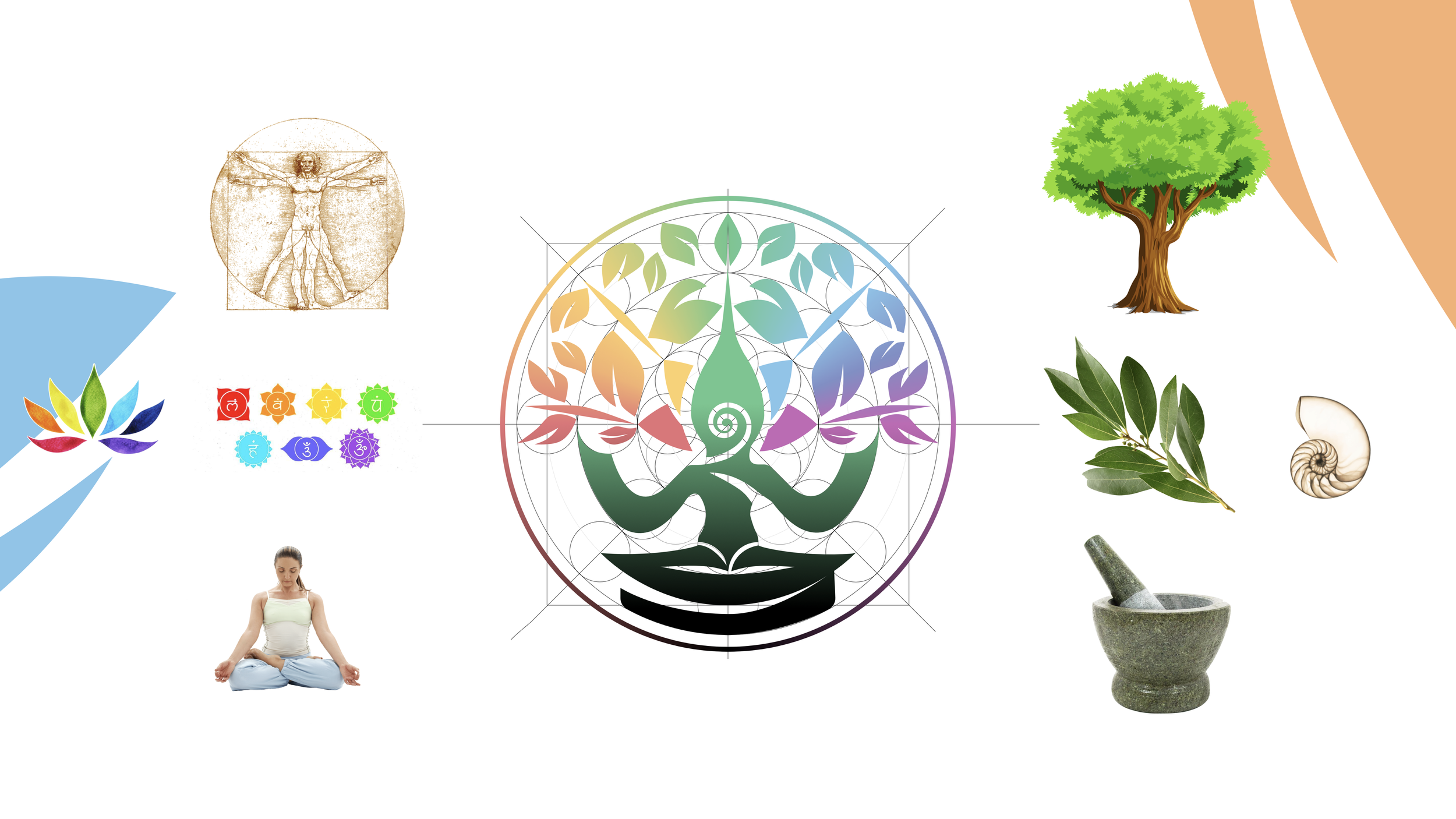
At the centre of the EnergyWorks design package, the art of Balanced Design takes centre stage.
Hoping to represent the balance of health, the goal of the design was to be balanced and structured, with a sense of calm despite incorporating various visual ideas and concepts.

In balanced design, colours become a powerful tool that communicates the essence of our Energy Works, inspired by chakras. White, serves as the key background, embodying purity and clarity, allowing the chakra-inspired colours to shine. However, all assets and colours have been optimised to still be suitable on dark backgrounds. By establishing a defined colour palette, it echoes the holistic principles of yoga and Ayurveda, weaving a narrative of balance.


The logo evolved as we pulled from difference sources of inspiration. We worked with Carol to get a sense of her core values and ideas, then moved onto understanding them ourselves. The hard work is then representing them in shape, form and colour. From here you can see how the elements of nature, connection and spirituality come into play for the main logo emblem.

The versatility of an emblem is paramount for maintaining visual integrity across a diverse range of uses. To achieve this, a dual-scale approach is employed, consisting standard and compact versions, with meticulous attention to optical compensation. Elements are subtly reconfigured to ensure legibility and recognition, even when space is at a premium.

Reflecting the theme of balance, we sought a typeface that was beautiful in both an ultra-light and an ultra-heavy weight. The goal was to push the extremes of both weights without resembling two entirely different typefaces, while maintaining a friendly yet professional appearance. The resulting logo typeface is the Coco Gothic type family. You can see this best illustrated here.

In alignment with the emblem's emphasis on balance, the wordmark has been proportioned to align with elements of the emblem. Purposefully crafted in two distinct layouts, this ensures the logo's adaptability, allowing it to flourish across a range situations.

With the extra assets saved for Carol’s eyes only, we are glad we could share this work with you. The care taken at every step shines through in this branding work and makes it just that bit more special. Though it may seem like a lot for a small business, it sets Energy Works up for all current and future needs.
If you have any questions or want to get in contact, you can email us through our Contact page.