
New buht.ER.flah.IES
‘New buht.ER.flah.IES’ [butterflies] is a bold and impactful art portfolio spanning 35 images, looking at the anxieties of post modernity, thought a combination of Machinima, graphic design, and an exploration of homelessness.


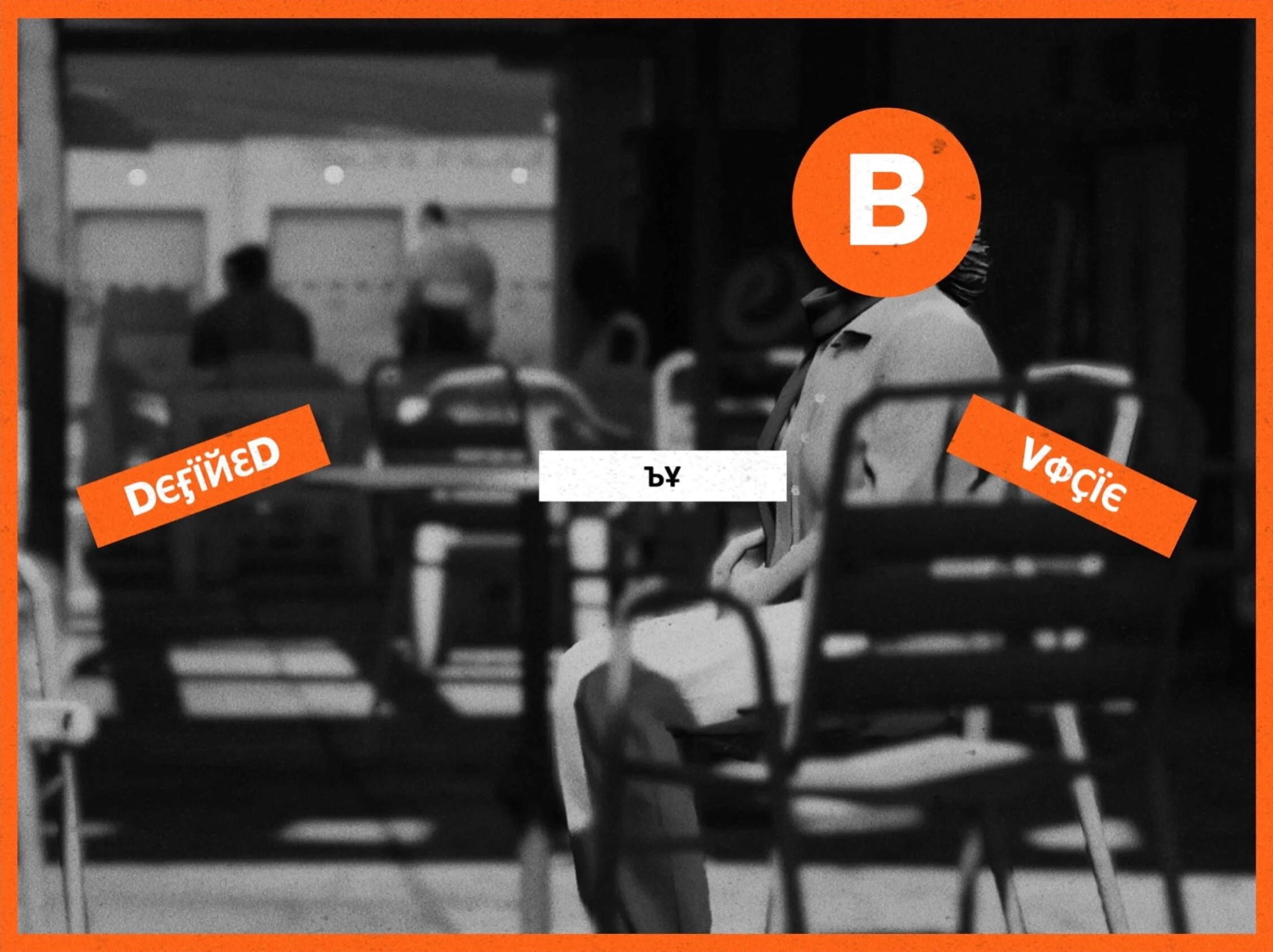


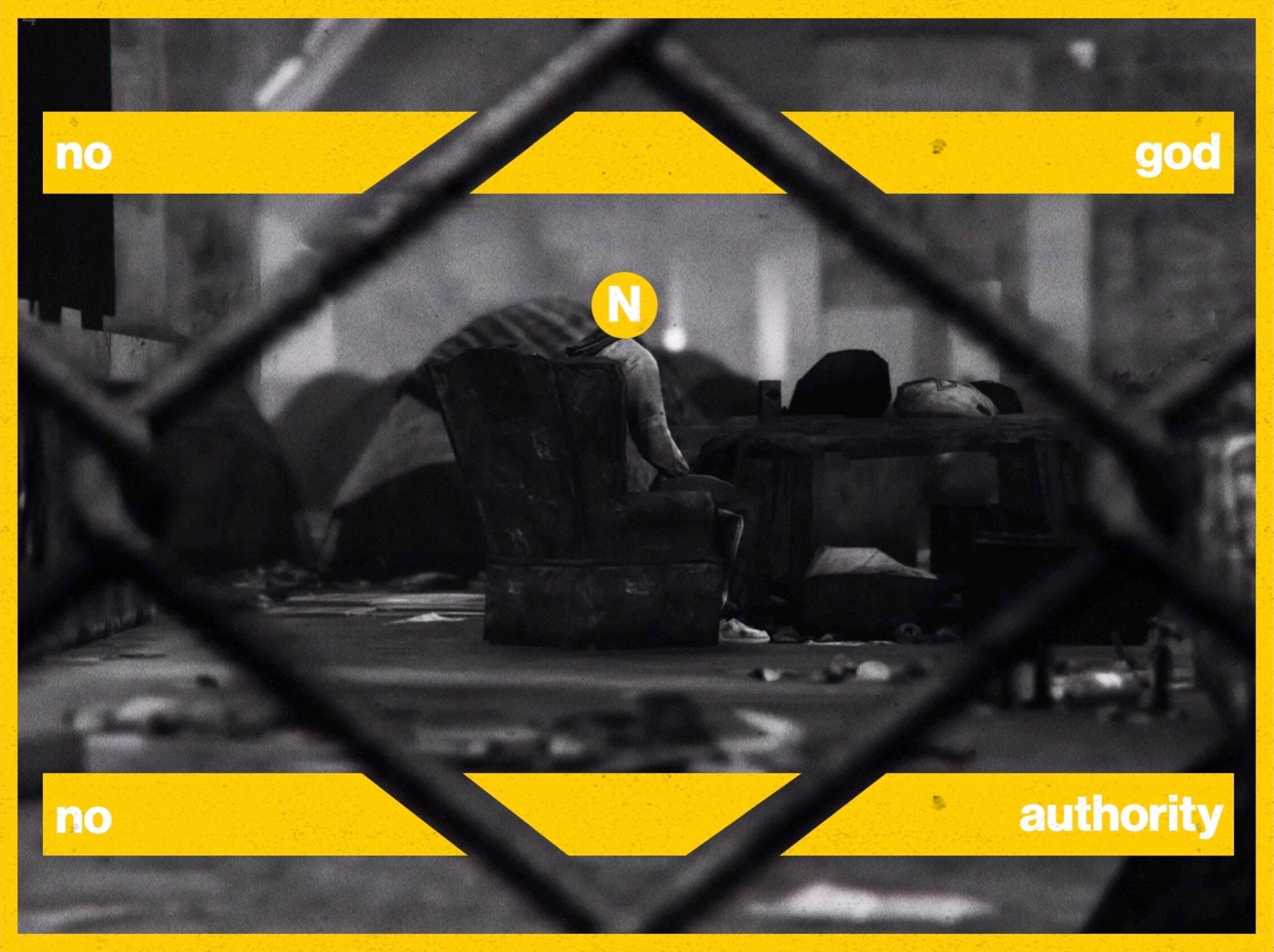


For me I wanted to create something that would be universal in its appeal so for this portfolio of work to try to convey the anxieties of living in postmodernity, the lack true authority, the lack meaning, etc. I would hope to this by using deprived characters as a method hyperbole to symbolise the extreme feelings that are present within a lot of us. I think my most significant inspiration Is that of Barbara Kruger, and the way her work wears it’s messages on there shelve and how it combines photography and graphic design. Secondly, I would say John Baldessari as I feel the addition of dots his in work, helps dehumanise people similar to that pf late-stage capitalism, secondly, I feel it also allows room for the viewer to project there owns meaning on to it. So with the vision combining graphic design and typography, and with the theme of modernity & lack character be key to my project I designed to step further away from the german Futura stylings of the work of Kruger rather take inspiration from Swiss Design of the 1950s and the International Typographic Style movement, as it symbolised standardization of identity and aggressive pursuit of modernism. To act as an evolution of the Baldessari dots I want to add numbers or coding to symbolise the numbers and labelling we are given in post-modernity. So since International Typographic Style distinctly uses only uses the Neo-grotesque sans serif class of typefaces, to tie the themes together I choice the typeface Neue Haas Grotesk. So with this the same typeface as New York City Subway nomenclature and New York often acting as the shorthand of the quintessential modern city, I decided that each photo would be symbolised by one of the service bullets, with there being 33 photos, one for each unique service bullet since the 1970’s re-standardization of the nomenclature.
So once I had selected my frames, I firstly cropped them from 16:9 to 4:3 to more accurately replicate 35mm image sensor and traditional photography, this is then followed by colour grading, a process of lower saturation to allow the design to pop, and increasing contrast lowering the brightness and manipulating these in a manner that allowed for the highest amount of dynamic range, and without losing detail and after which a degree of sharpness is applied to emphasis the grit, grim of the subject matter.
I had 33 photo names/ letter & numbers pre-decided and so from here I assigned photos to names, an example of this can be seen with photo M were, where I modified the architecture in photoshop to include several M shapes to accompany the use of alliteration. The photos are then given there dot’s or hexagons, and border to help tighten the composition of design & photography. This point I would analyse the photos to determine themes and ideas, and would research these ideas in reference to literature, pop culture and academia to find a quote to pair with it, with key inspirations coming from postmodern scholars and gangster rap of the 1980s for its commentary on modern America from a disadvantaged perspective such as can be seen with the Tupac Shakur quote on photo R. When designing the photos, I worked to strike a thin balance between being bold and not taking away from the photography, thus to avoid the photos from feeling like two separate flat layers In several photos such as photo C, I masked several layers and pushed elements of design into the background to add depth . I also choice to only use lower case for the quotes as to separate the upper case nomenclature.
Upon completing the design, I moved on to compositing – firstly I started by adding a 35mm grain to firstly give it more nature photography like quality, and secondly to help mesh the design and photography together as if to give it consistent texture as can be seen in the greens of photo G. Then finally a grit texture with blended to help add some blemishes to the pristine blocks of colours, and more so complement the subject matter as can be seen with photo N. With project deploying hyperbole to convey universal feelings, I wanted the final photo, US, to be simple I wanted it to be a canvas to reflect back the themes of the portfolio back to the audience, thus it is the only photo not feature colour of no additional text. With creating this project I treated it like it was a book, being like its cover the cover, and deployed a wide- angle to capture as many dots as possible and titled the project ‘New buht.ER.flah.IES’ [butterflies] with the concept being that we are all born caterpillars, and we all find ways to get through life, but some never get the opportunity to develop themselves properly, but we are finding ways to become butterflies, with the phonetic spell being used show alternativeness and individuality of postmodernity, and to reflect back the disadvantage characters featured in the photos.